Crafting an Impactful
Marketing Toolkit
Summary
Einstein Industries is a long-standing SEO and website development partner for elite medical, dental and legal practices. I helped Einstein completely redesign their website, marketing materials, and their overall marketing approach.
Role & Responsibilities
- User Experience Design
- User Interface Design
- Graphic Design
- CSS Coding
- Animation
- Marketing Consultatant
Assets Delievered
- Brand Style Guide
- Website Designs
- Website Build in CMS
- Promotional Emails
- Illustrations
- Slide Decks
- Infographics
- Animated SVGs
Metrics of Success

Increased Use
Increase the usage of the marketing assets from never being used, to being a part of the majority of sales presentations.

Improved Quality Ratings
Improve perceived brand quality and content accuracy ratings of the new assets among the sales team and clients.

Increased Conversions
Increase conversion rates for Email marketing campaigns that utilize the new assets.
Solutions
Website
I designed the website, as well as the animations and illustrations used throughout. I also collaborated with a writer and the head of sales and product development to organize and shape the content.
View Live Site


Website Formatting & Organization
The true differentiators that make Einstein stand apart from their competition needed sometimes lengthy explanations. Rather than trying to break down long pages into smaller ones, we focused on organizing the content of each page into large, logical groups and making it easy to navigate between those groups


Slide Decks
I designed the website, as well as the animations and illustrations used throughout. I also collaborated with a writer and the head of sales and product development to organize and shape the content.


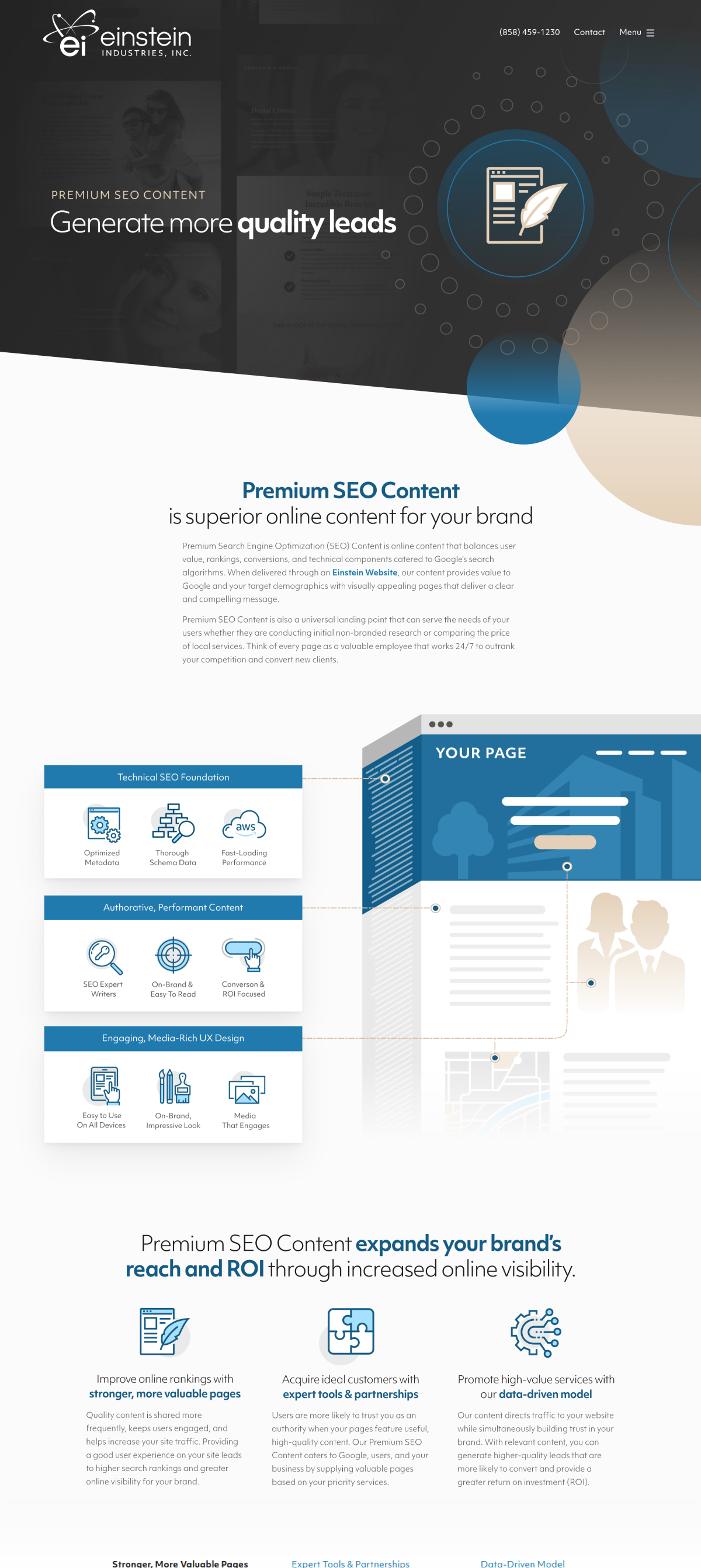
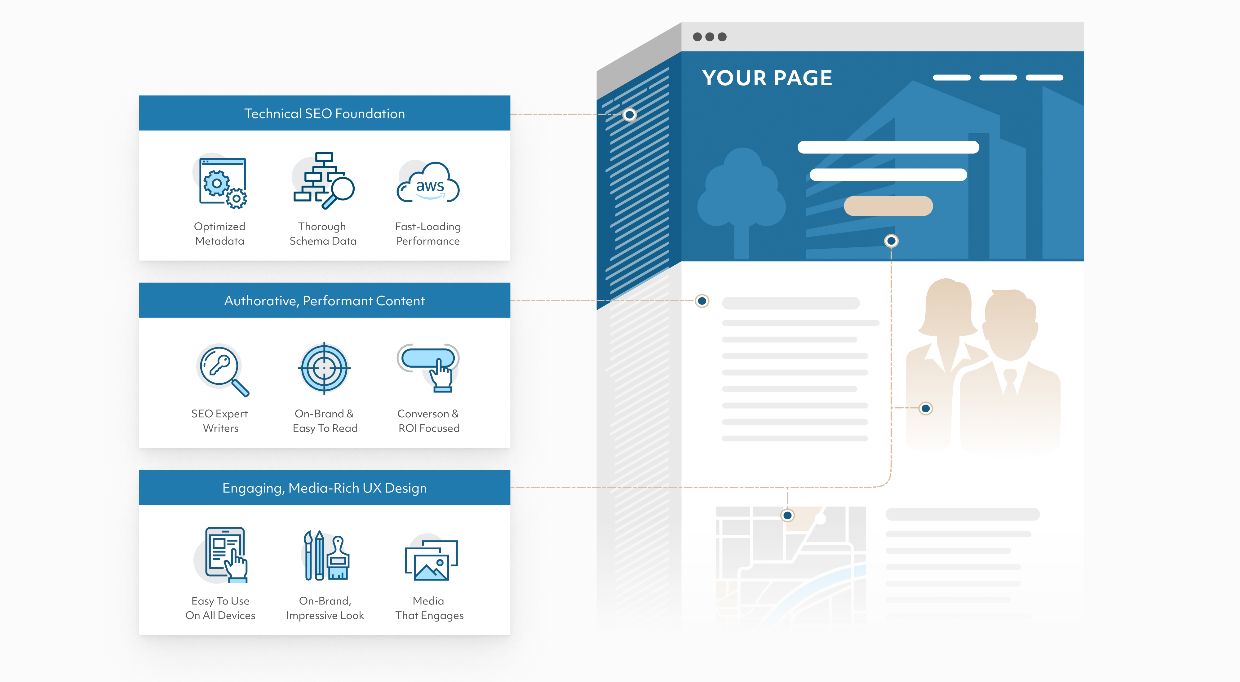
Illustrations & Infographics
I designed the website, as well as the animations and illustrations used throughout. I also collaborated with a writer and the head of sales and product development to organize and shape the content.


.jpg)
Research
The Einstein Sales team was already doing a great job pitching the value of Einstein to clients without many marketing materials in their toolkit. Through stakeholder interviews and audits of successful pitch decks used to create new client partnerships, we would gain a clear direction for making effective marketing assets.
Content Insights
- No clear differentiators against competitors or value proposition
- No clear market position targeting
- Inconsistent messaging between sales presentations and website
- Hard to scan, no clear summaries of complex topics
- Focuses more on selling SEO itself, rather than why Einstein is an ideal SEO partner
- Emphasizing individual services over long-term holistic strategies
Design Insights
- Doesn’t convey confidence
- Isn’t as impressive as websites Einstein makes for their actual clients
- Inconsistent colors and branding direction
- Dated looking design styles
- Not serious enough
- Boxy, looks very generic
The site focuses too much on convincing clients that SEO is important, but our ideal clients already know that. It should be focused more on why Einstein is the best choice.

The site looks a little cartoony sometimes, it can be strange convincing a client we’re a serious partner worthy of their investment.

Goals Created From Research

Ideate
I began building a new visual brand direction based on the goals created from our research. I first iterated on typography to build a strong foundation, then experimented with colors, styles and eventually content formatting and illustrations. I worked closely with the content writer during this process so we could allow strong design ideas inform the content and vice-versa (e.g. bigger and bolder taglines require a concise writing style).
Primary Tools: Pen and Paper, Figma, Illustrator, SVGator
Showing the various iterations of pages and illustrations created
Typography
A sans-serif font seemed like a clear initial direction to convey the modern direction of the brand. Focusing on the brand image of being bold, confident, and serious, I began searching for a sans serif that was a bit more geometric to convey stability. I also favored descenders that had hard edges to them rather than curling descenders on lowercase g’s and y’s for example. The idea hear being we favor confidence over friendliness.
Explorative Iteration


Explorative Iteration


Chosen Iteration


Colors, Graphic Style & Illustrations
Initial experiments involved the brand’s historically main color, a dark blue. I experimented with making this more confident and bold. The ideal ended up being a high-contrast approach with dark greys and white, using blue as a highlighting color. Hard edges were used for transitions, and geometric shapes were also included as accents to support the font and show a confident, professional flair.
Explorative Iteration

Chosen Iteration

Showing the various iterations of a specific slide for a slideshow created while working towards an ideal solution.
Implement
We developed a sales-driven approach to ensure consistency and effectiveness for all marketing materials for each service. Each service first had pitch decks created, then supplemental infographics and email templates, and lastly web pages. The pitch decks forced us to be clear and concise with the limited constraints of slides. We then adapted them and expanded where appropriate across other mediums.
1. Pitch Decks
2. Infographics

3. Webpages
